About the Challenge
'...your challenge is to share button starter kit for e-learning. Include as many different button types and styles as you’d expect to use in a typical course.' is how David Anderson, Articulate community manager, worded challenge number 133.
My Entry
The Thinking
 Structure of a Button Structure of a Button
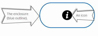
If you look at a button, you will notice it has two distinct parts: enclosure and text and/or icon. I decided to customise these two parts, and create a unique set of buttons.
The Idea
Typically, the enclosures have a single complete shape. So one gets to see a complete circle, or a complete rectangle etc. I thought of creating only a partial enclosure. By partial enclosure, I mean that if the button is rectangular in shape, then only 2 lines – one vertical and one horizontal – will be visible to the viewer.
When it came to the text and the icon, I decided against showing both at the same time. Rather, I thought that only the icon should be visible, and the text should be displayed upon hovering. This thinking gave me two advantages. Firstly, I could create concise buttons. Secondly, people usually expect something to happen when they hover over a button; therefore, if the text is displayed on hover, then my button will fulfil the public’s general expectations.
The Execution
For the icons, I decided to include symbols from the fonts belonging to the dingbat family.
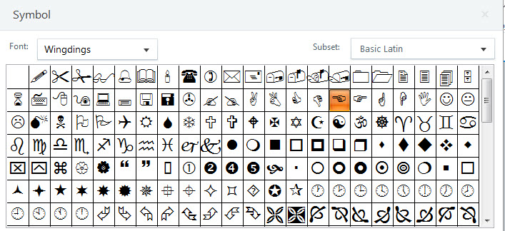
Wingdings Font - A member of Dingbat Font
Accordingly, I chose the pointing fingers as icons for my ‘Next’ and ‘Back’ icons. However, when it came to creating icons for other buttons such as Home, Menu etc., I was in two minds.
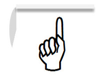 First Attempt at Creating an Icon for Home Button First Attempt at Creating an Icon for Home Button
I did not know whether to use the different hand formations as my icons or choose some other symbols. I first tried the hand formations. For example, an upward pointing finger became my home icon. Now I believe that an icon should convey meaning, or rather provide hints, instantly without putting much strain on the viewer. My home icon was not doing this. A finger pointing up was hinting towards a direction rather than a home page. I, therefore, ditched using hand formations as symbols and made use of other symbols.
The only time the hand formations appear as icons are for the Submit and the Notes buttons. I used the upwards pointing finger as an icon for the Submit button. The reason was that when you submit something in a virtual world, you are actually giving it to someone who is a kind of higher authority. In the real world too, when you submit something, say your answer paper, there is this brief upward action that your hand performs.
When it came down to creating the enclosure for my buttons, I will confess that I tried combining different shapes. After trial and error, I settled for a line and an arc. A dash of grey colour and a shadow effect completed the enclosure.
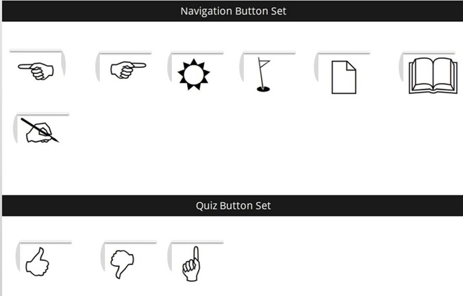
The Final Set of Buttons
My Final Take
I enjoyed this challenge as it gave me an opportunity to try my hands at creating customised buttons. Also, I became more familiar with dingbat fonts after this challenge.
Full Disclosure: Initially, I had just made the icons. However, my buttons were lacking the feel and look of a button. That’s when I realised that an enclosure coupled with a text/icon makes a button.
0 Comments
Leave a Reply. |
 RSS Feed
